The transformation
A website designed around both the people seeking support and the practitioner providing it.
Hope Wellbeing had grown beyond its original website. Tracie Turner’s experience spanned one-to-one counselling, clinical supervision, training and education, but the digital presence did not represent that depth or provide distinct routes for clients, trainees and supervisees.
01
The original situation
The website needed to do more than introduce a counselling practice. It had to establish safety and professional credibility quickly, answer recurring questions, gather useful information and create more structure around Tracie’s working day.
Someone reaching out on a difficult day needed to recognise that their concern was understood, see whether Tracie’s approach felt right and know what would happen next without being overwhelmed by clinical language or pressured into a decision.
02
The strategic response
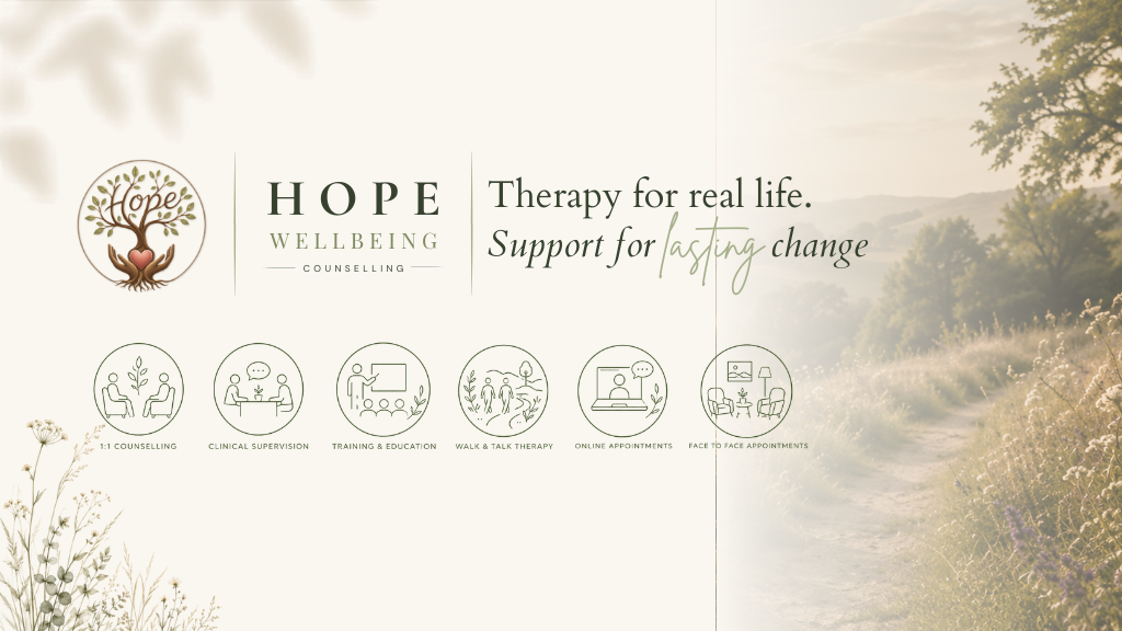
I reorganised the practice around three connected routes: counselling, clinical supervision, and training and education. Each audience now has its own clear path while the whole experience still feels like one calm, credible practice.
Concern-led entry points, plain-language explanations and carefully placed evidence of BACP registration, insurance and professional approach reduce uncertainty before asking anyone to act.
03
What sits behind the screens
The visible pages are supported by consultation, intake, common-question, resource, testimonial and training-interest journeys. Together they help people arrive better informed and give the practice a more structured way to manage different kinds of demand.
The site is still in content review, so this case study does not claim improved enquiries, reduced administration or search performance before those outcomes can be evidenced.
Key decision
Make the free consultation the consistent first action.
Why it matters
A low-pressure route lets someone ask for help without committing to a format before they feel informed and ready. Reassurance comes before action.