
The transformation
A brand system that gives every property touchpoint the same point of view.
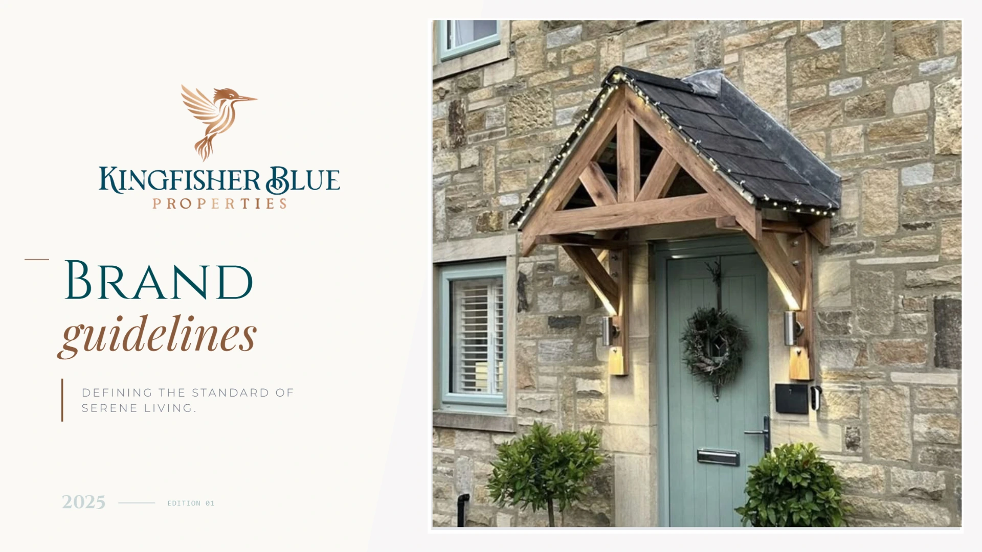
Kingfisher Blue Properties needed an identity that could work beyond a single logo: something clear enough for everyday use, considered enough to build trust and flexible enough to carry across future materials.
01
The brief
The brand needed a visual foundation that could be used consistently across property communications, presentations and digital touchpoints without making every application feel identical.
02
The system
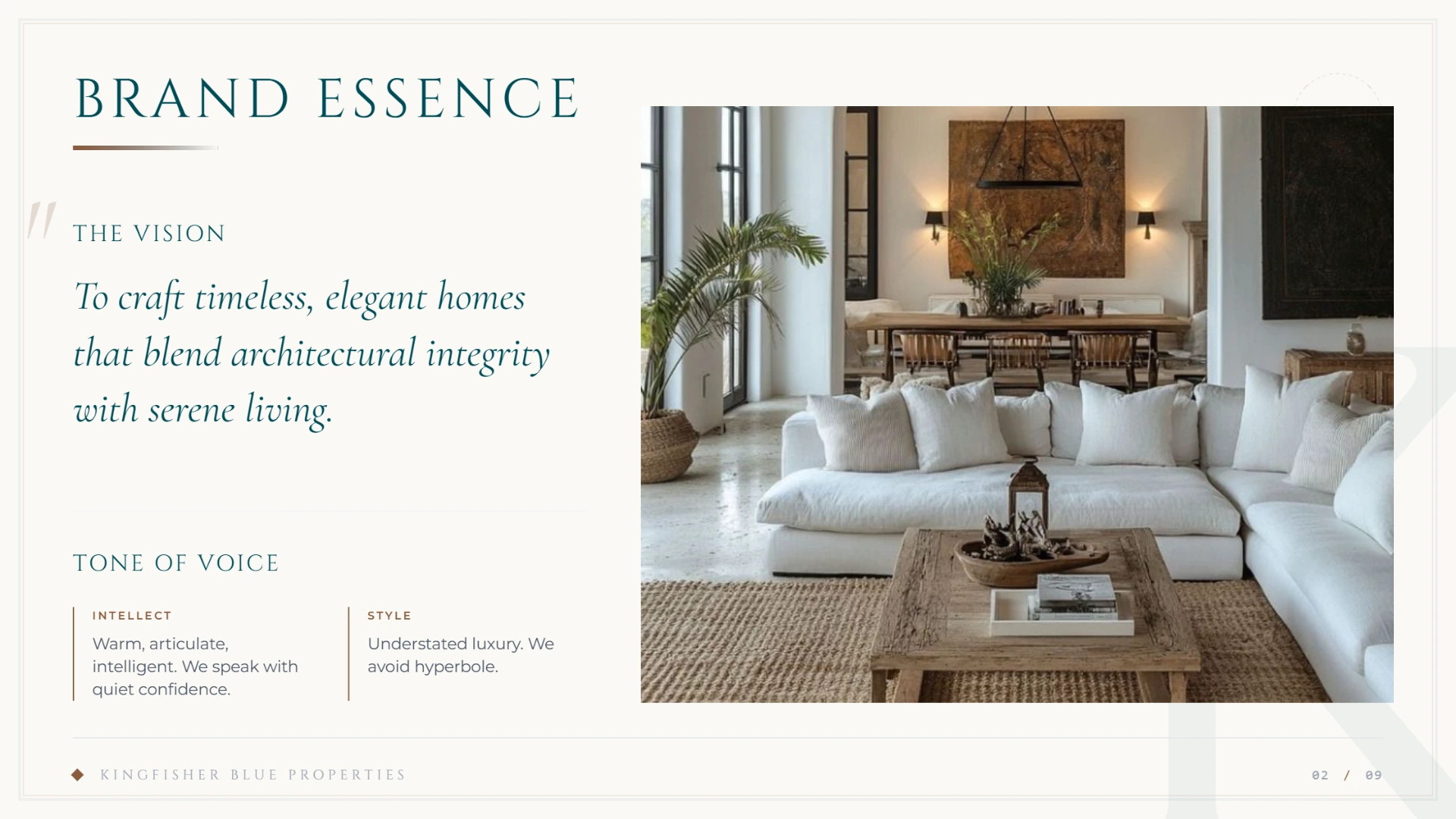
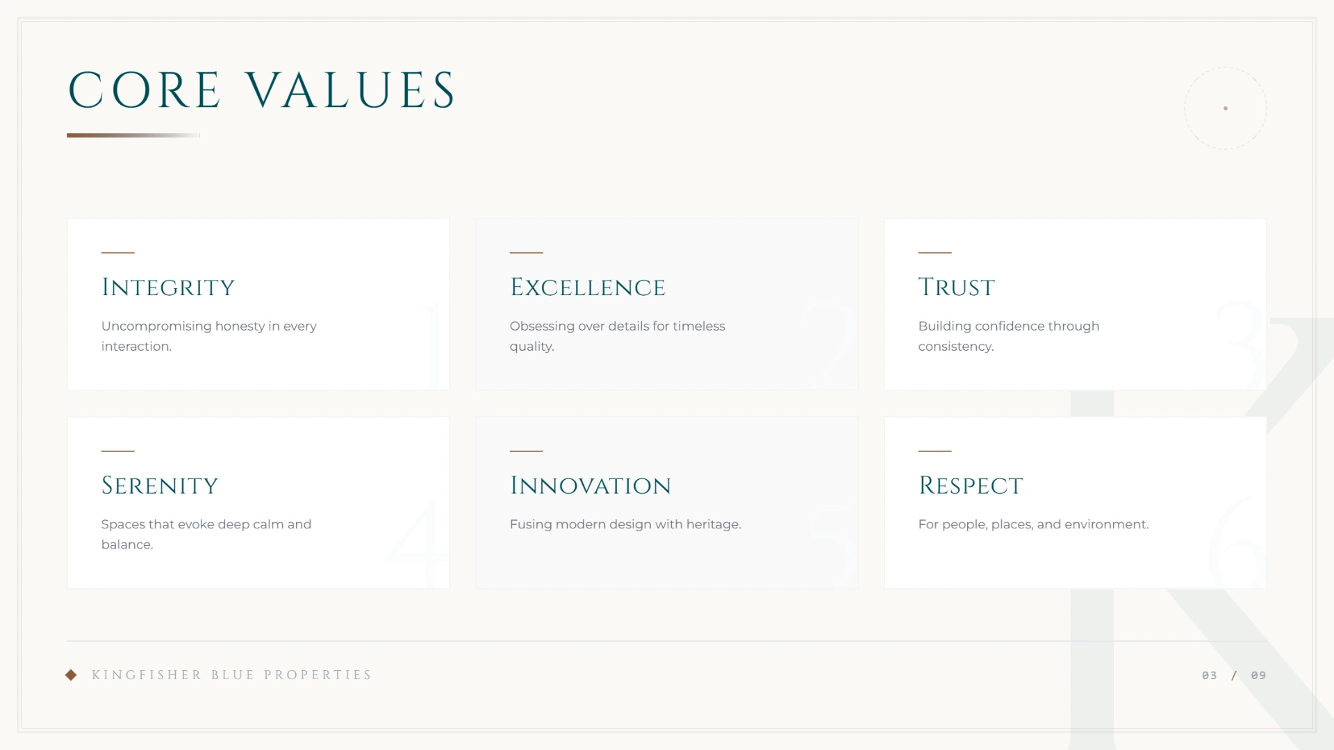
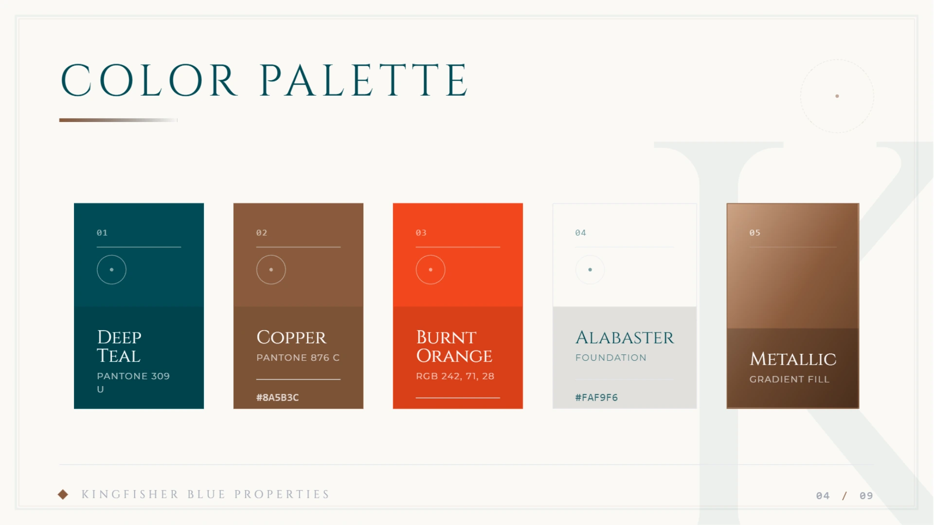
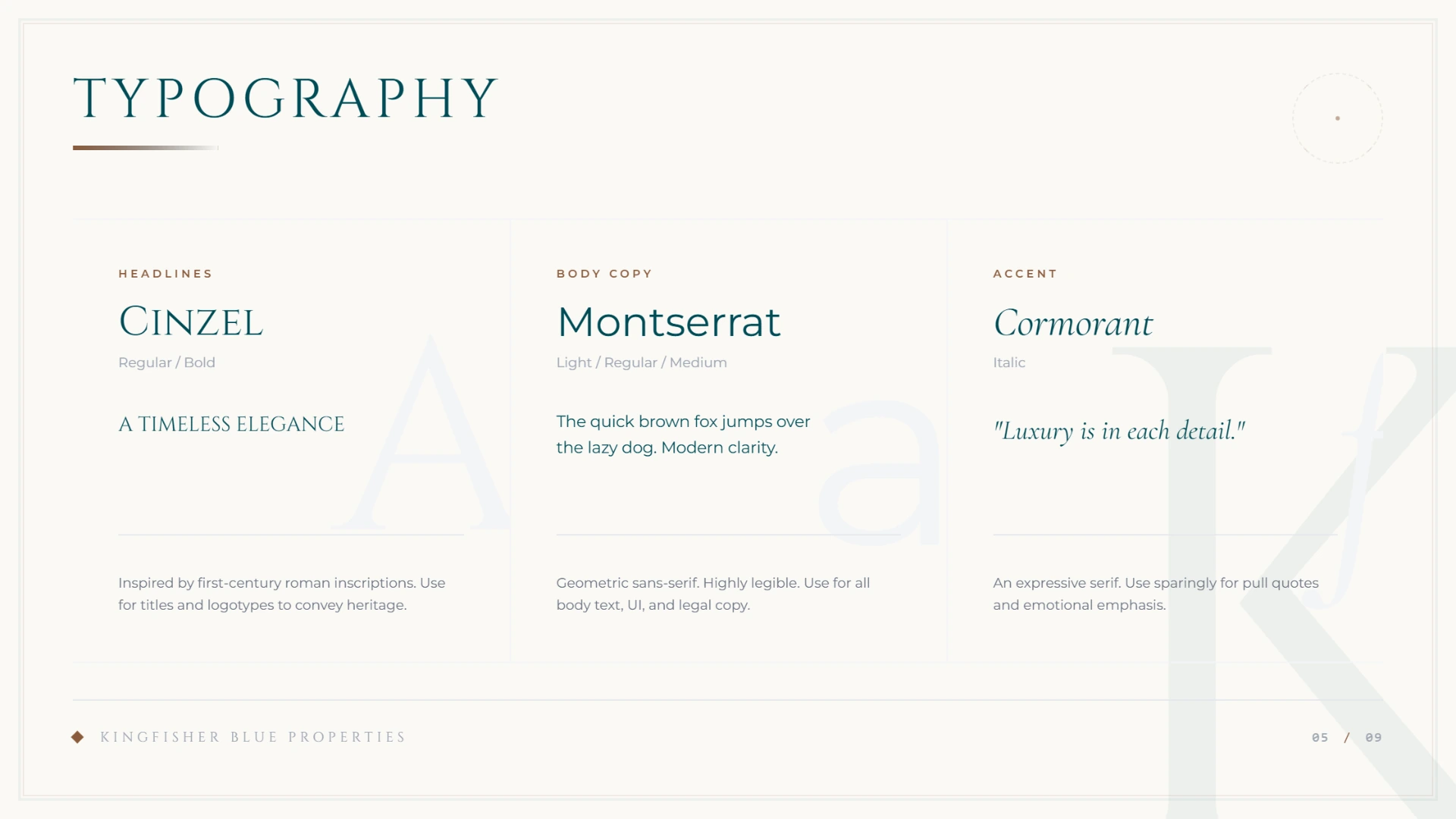
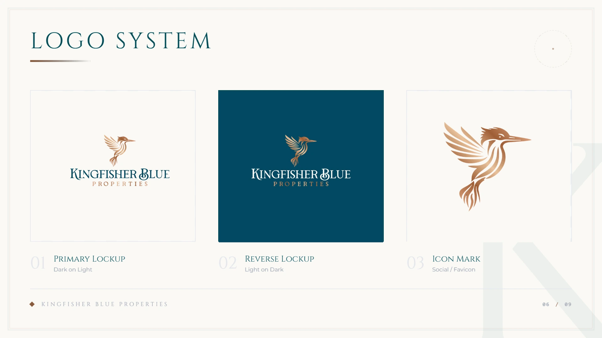
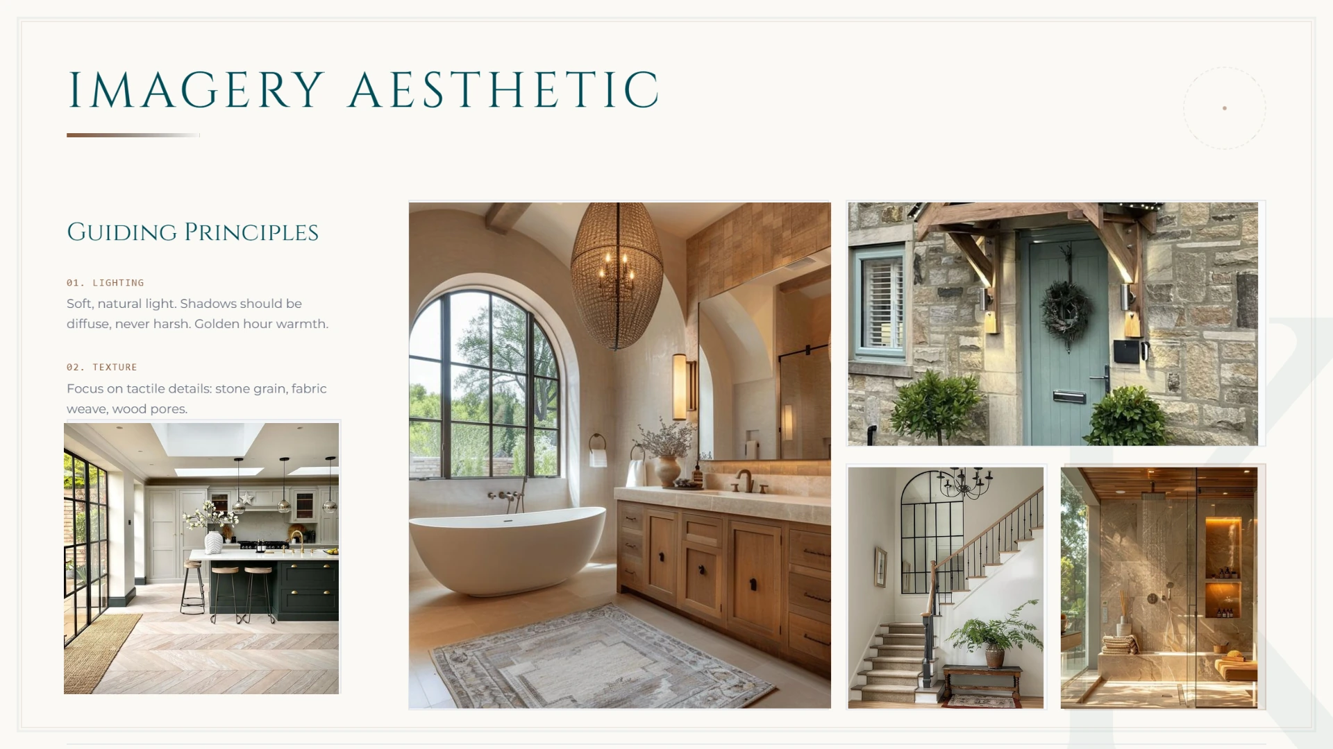
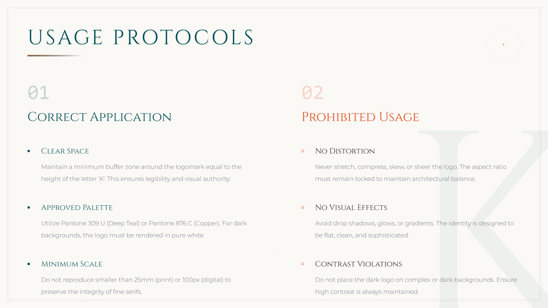
I shaped the identity around repeatable decisions: colour, typography, spacing, logo use, imagery and layout. The guidelines turn those decisions into something practical that can be followed as the business grows.
03
The outcome
The result is a concise brand-guidelines document that gives Kingfisher Blue Properties a clearer visual language and a more dependable base for future communications.
Key decision
Make consistency feel useful, not restrictive.
Why it matters
A good guideline system should help the next piece of work move faster while leaving room for the business to communicate naturally.