
The transformation
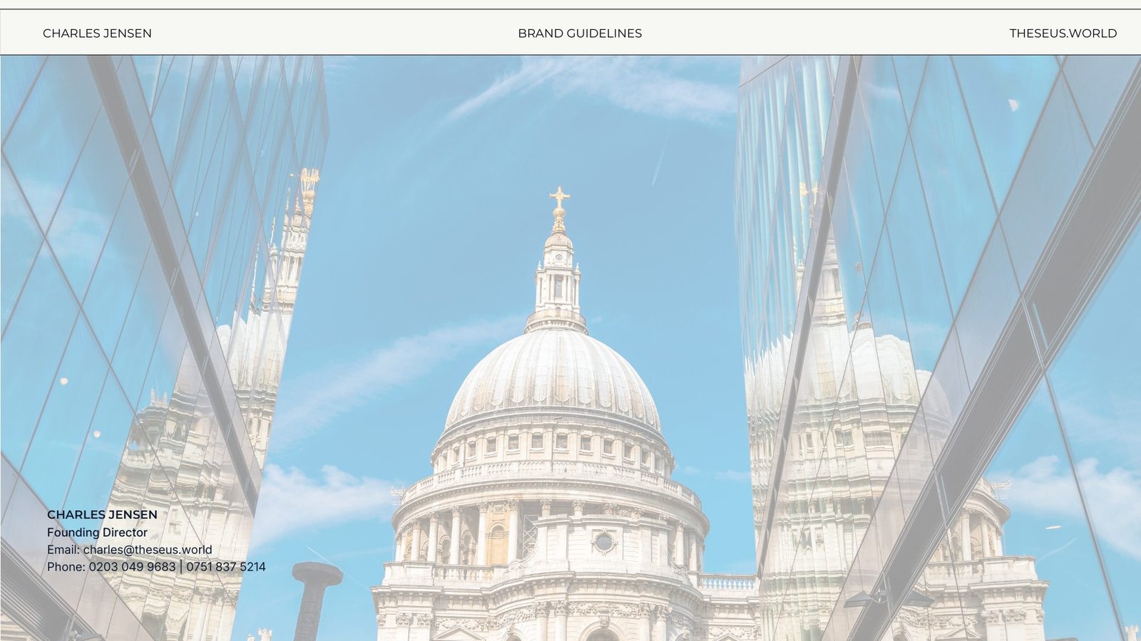
A visual system for the company Theseus was becoming.
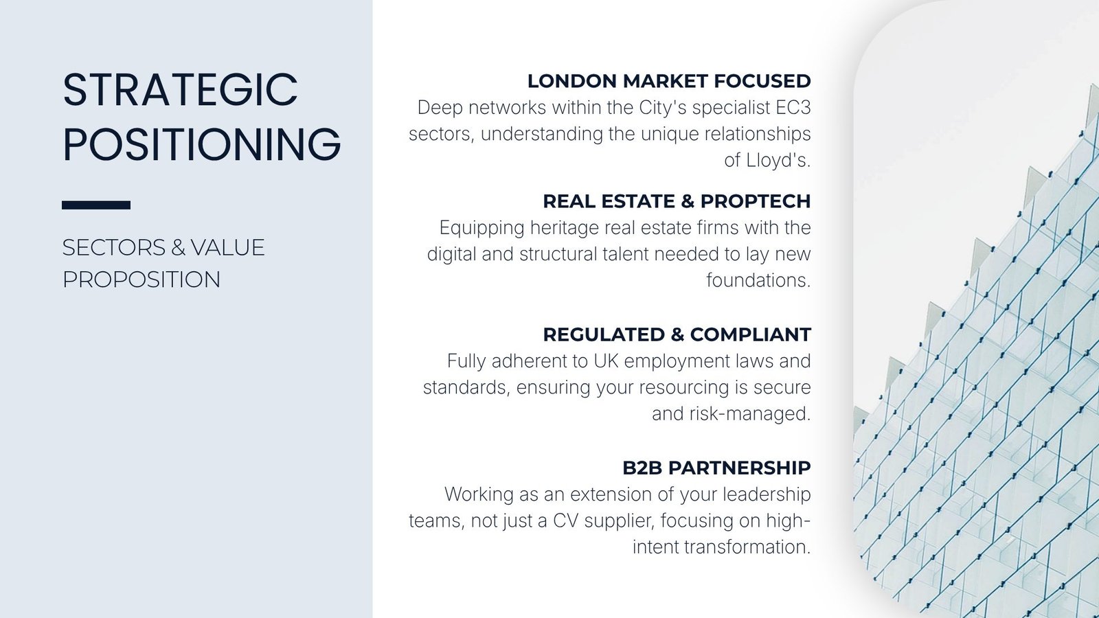
Theseus needed brand language that could hold the breadth of its specialist markets while still feeling direct, confident and human.
01
The brief
The identity needed to make a complex offer easier to recognise across insurance, real estate and technology transformation, without falling into the language of a generalist staffing agency.
02
The system
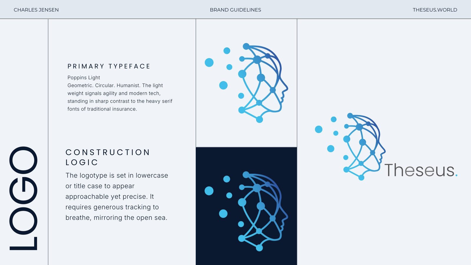
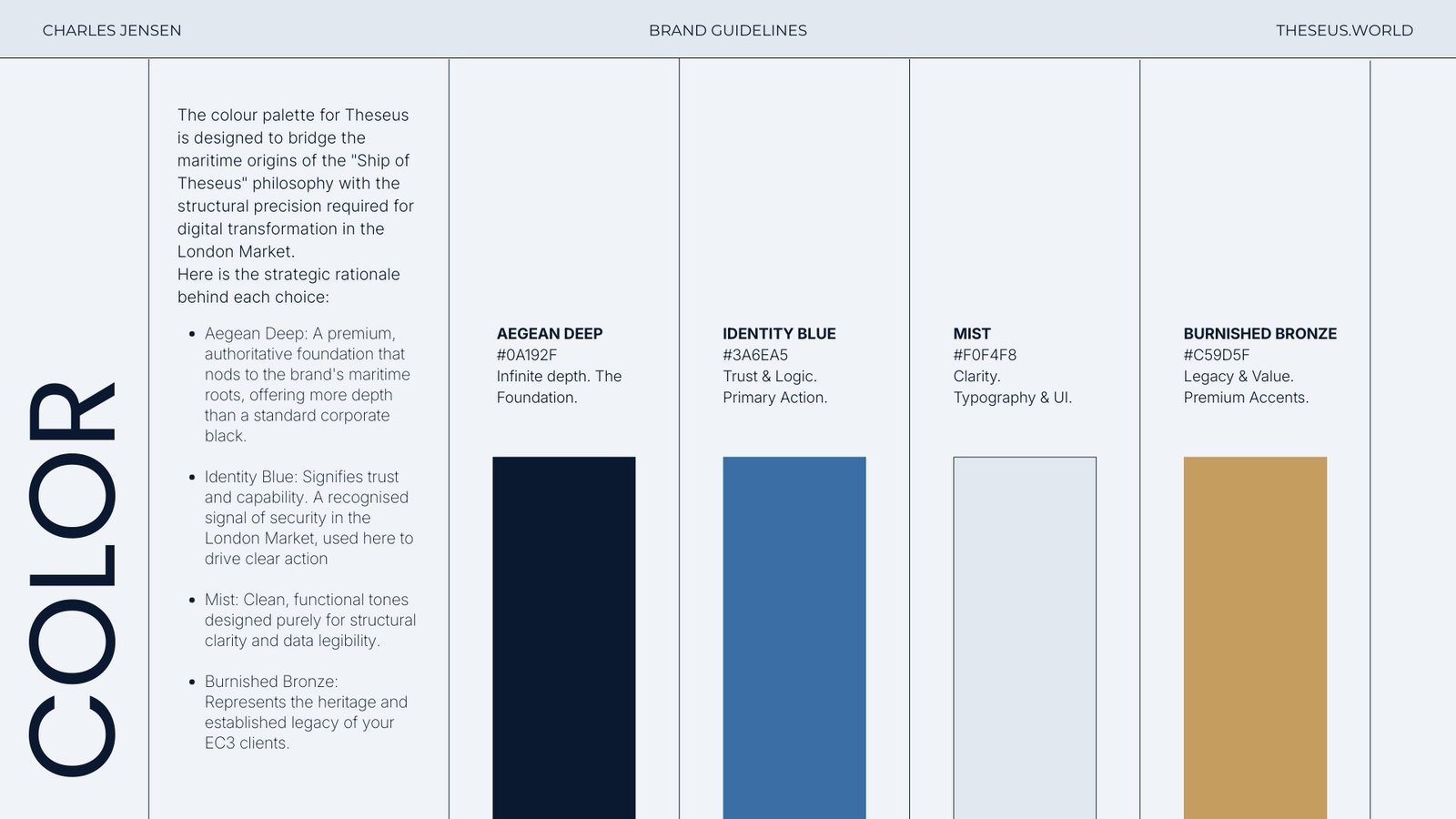
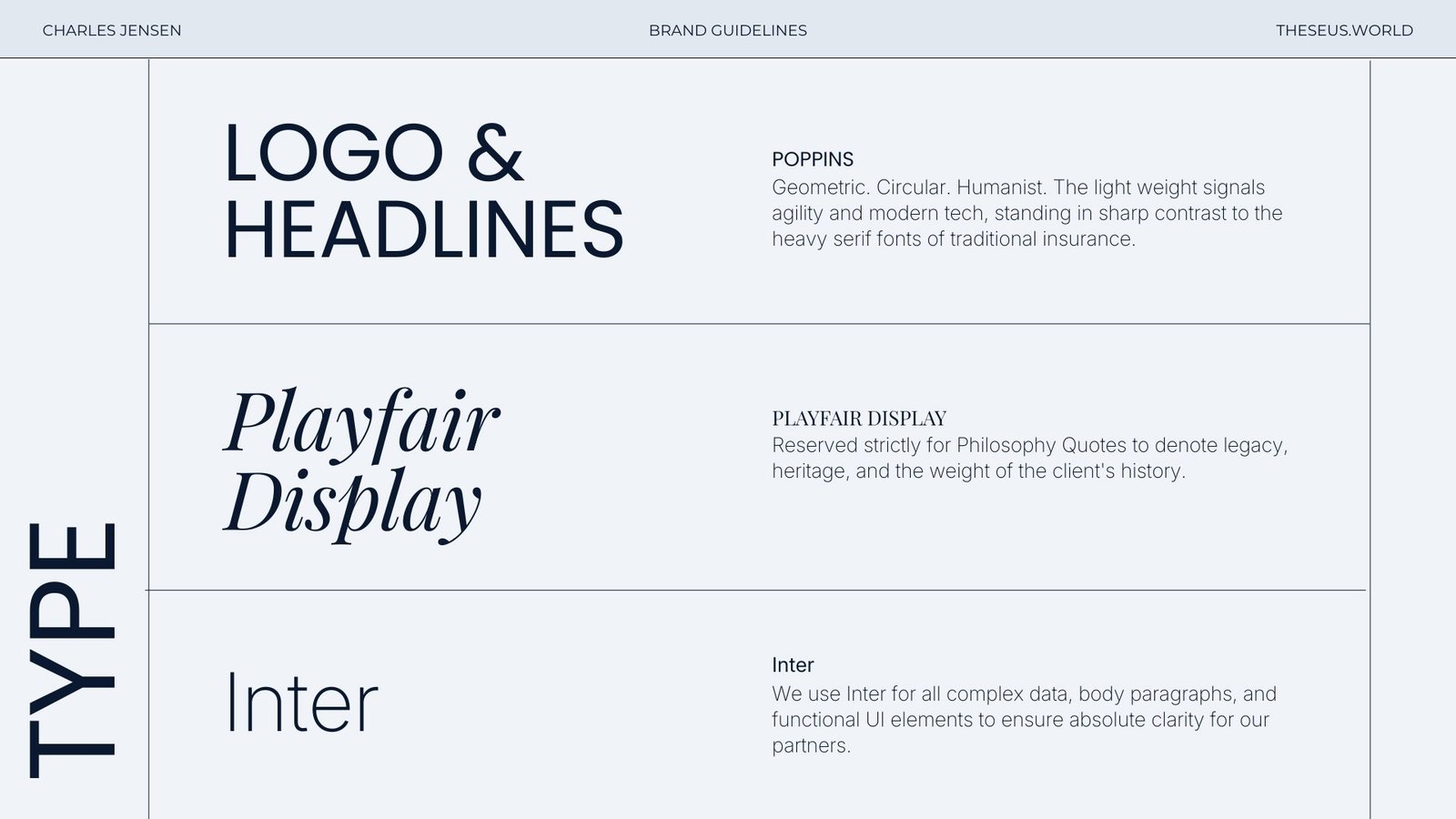
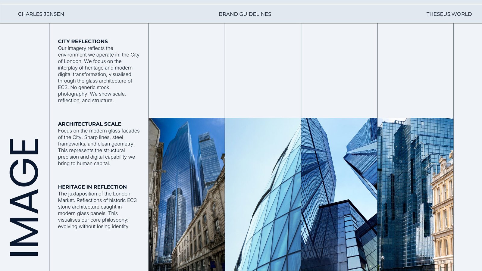
I developed a practical guideline system around the Theseus idea: a confident blue-led palette, clear typography, disciplined layout, image direction and a consistent way to present specialist expertise.
03
The outcome
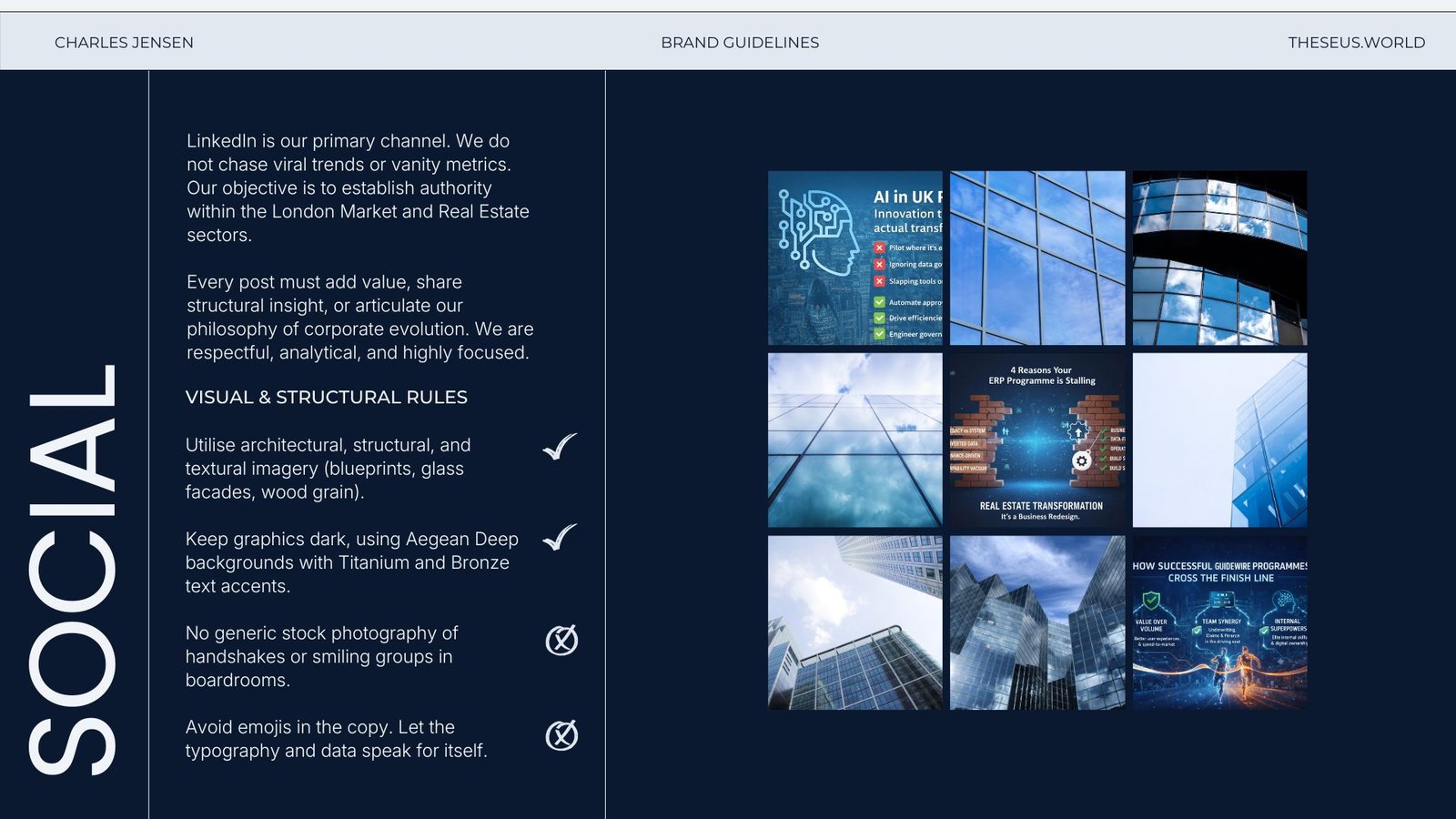
The result is a cohesive identity reference that helps the growing business communicate consistently across its website, proposals, presentations, social channels and future touchpoints.
The guiding idea
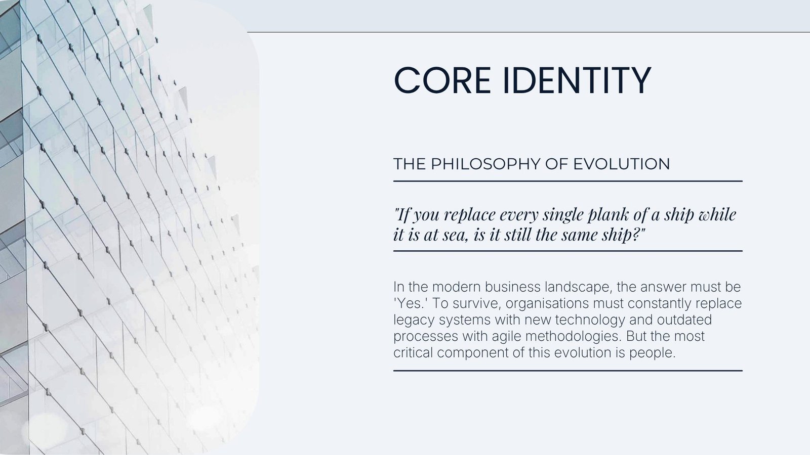
Evolution without losing identity: a brand that can change shape as the business grows, while remaining recognisably Theseus.
Key decision
Make specialist capability easier to see.
Why it matters
Clarity lets the right people recognise relevance quickly, then gives the wider story enough room to deepen the conversation.